By
As a global forecaster, you must respect teleconnections—patterns that link weather and climate across distant regions. If you are not a forecaster or merely a climatologist, you may not realize that the very idea you are promoting could undermine your argument.
Related: How the IPCC Buried the Medieval Warm Period
The “hockey stick” graph in climatology has caused more global harm than actual hockey sticks used as weapons in hockey games—and that’s saying something. Anyone who has been hit by a hockey stick, intentionally or not, knows the pain. However, from the outset, when Dr. Michael Mann refused to share his data or explain how he weighted the regions he sampled, his work should have been questioned as a serious scientific contribution. The current weather pattern in Europe is about to demonstrate exactly what I mean.
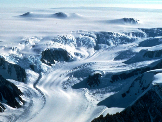
Although neither I nor any skeptics I know have access to Mann’s weighting methods, the areas he sampled are noteworthy given the current hemispheric weather pattern. One key region is the Polar Urals. By oversampling certain areas or failing to understand that a warm period in one region might correspond to a cold period in another, Mann’s methodology could erase evidence of the Medieval Warm Period (MWP).
Consider the tree ring record from the Polar Urals. The critical question is: what does the rest of the data show? Here’s the key point: when it’s cold in the Polar Urals, it’s typically warm in Western Europe. And when Western Europe is warm, the planet is often warmer overall. Why? Because the weather pattern that brings warmth to Western Europe is often associated with a La Niña base state, which promotes Northern Hemisphere ridging and widespread warmth. A clue to this pattern would be cold conditions in the Polar Urals with no warm signal, contrasted with warmth in Europe and cooler conditions on the Asian subcontinent. This pattern is evident right now.
My point is in paleoclimatology


The planetary temperature is .49C against the 30-year means. Yet one of the main sampling areas if the planet is warm, would be cold.
My point is that a globally warm pattern, like the one we’re seeing today, may include cold regions, even if the overall global temperature is elevated. Despite Mann’s expert witness not being a meteorologist, their statistical analysis dismantled his work. If Mann had paid closer attention to weather patterns, he might have realized why the hockey stick graph was a flawed concept from the start (and I’m being generous with that description).
Summary from Grok
In the defamation trial of Mann v. Steyn and Simberg (2024), the statistician who testified was Dr. Abraham Wyner, a professor from the University of Pennsylvania. His testimony focused on the statistical methods used by Dr. Michael Mann in creating the “hockey stick” graph, which depicts global temperature changes over time. Wyner was one of the few expert witnesses whose testimony was deemed admissible by the court, as it met the standards of reliable methodology under the Daubert standard.
Wyner testified that Mann’s statistical methods in constructing the hockey stick graph were “manipulative” in effect, if not intent, and that the graph was “misleading.” Specifically, he argued that Mann’s sampling and data handling techniques understated the uncertainties inherent in the proxy data (e.g., tree rings) used to reconstruct historical temperatures. Wyner’s key points included:
- Understated Uncertainty: Wyner stated that the error ranges in Mann’s hockey stick graph were “much too narrow,” implying that the graph presented a falsely precise picture of historical temperature trends. He argued that the uncertainties in the proxy data were far greater than what Mann’s graph suggested, making it impossible to definitively claim that recent temperatures were unprecedented compared to earlier periods.
- Data Manipulation: Wyner’s testimony suggested that Mann’s methods, particularly in how proxy data was selected and processed, could be seen as manipulating the data to produce a desired outcome (the hockey stick shape). He emphasized that this manipulation was evident in the statistical techniques used, though he did not claim intentional fraud.
- Misleading Representation: Wyner argued that the hockey stick graph misled viewers by downplaying the variability and uncertainty in historical climate data, thus exaggerating the certainty of modern warming relative to past centuries.
The hockey stick graph underscores why climatologists should be required to forecast global weather patterns. Universities offering climatology degrees should mandate a two-year course in global forecasting. In the interest of transparency, my background in forecasting stems from a lifelong fascination with weather, sparked by my father’s insistence and my childhood study of his climatology, geography, and geology books. These texts, unlike his meteorology books with their advanced mathematics, were easier to understand. With over 60 years of studying weather patterns, I believe this experience gives me an advantage.
When you observe current weather patterns and recognize that past sampling might misrepresent a warm period as cold, you understand why climatologists must engage in applied forecasting. Mann’s refusal to allow scrutiny or reproduction of his work is strike one. Strike two is that his conclusion may actually support the opposite of what he claimed. Strike three is succinctly captured in Grok’s summary above.
Ref.: https://www.cfact.org/2025/04/28/current-global-pattern-shows-why-hockey-stick-strikes-out/
- Claim: Climate Apathy is Outpacing the Climate Crisis
- Earth Is Greening: Thank Climate Change
- Supreme Court Could Upend California’s EV Mandate